
Coding and Design. A love / hate relationship. Some developers dread the tedious task of implementing design guidelines provided by UX / UI Designers, others love to make things beautiful. I identify with the latter, but at the same time, why not build a smart system that will reduce the time and confusion in adopting design guidelines. We will have a look at how to create a Component System that makes your development process stupidly fast and still follows and enforces design guidelines. I will first introduce the styled-components library and then show you how to build a design system with it.
Prerequisite: Design System
To enable this workflow, we will need some design guidelines that we can follow. In the last years, many big companies rebuilt their design systems, such as Microsoft, Airbnb, IBM and many more. These design systems can range from color palettes, defining border-radii, margins, paddings and so on to fully fledged UI components, such as cards and containers and even UX-focused components that include workflows, animations, and some logic.
If you do not have an explicit design system, don’t worry. We will start very simple and you can extend it over time. I started out with a couple of components and for many of my projects I can reuse some or all and just adapt to the new project.
We will have a look at building layout components, buttons, text components, and some more feature-packed components, including animations.
A quick introduction to styled-components
Let’s first talk about what styled-components does and how to use it. I will also describe why I prefer it over other possibilities to style a web application.
Styled-components is a kind of CSS in JS solution, meaning that you do not have external CSS files to fiddle with. Everything is in one place — logic, styling, and markup. At first sight, this might seem confusing and if you don’t know how to handle it, your JS files will blow up in no time. This article is here to provide you a guide to prevent that and efficiently write components.
The basic usage of styled-components is as follows:
import React from 'react'
import styled from 'styled-components'

const StyledButton = styled.button`
    border-radius: 5px;
    background-color: #a1cdf1;
    color: #fff;
    padding: 10px 15px;
    outline: none;
    border: none;
    cursor: pointer;
`

const Application = () => {
    return <StyledButton onClick={() => console.log('clicked')}>Click me</StyledButton>
}
As you can see, you can basically put any kind of CSS in the style declaration. Styled-components exports all of the common HTML elements, so you can use them from the imported package, for example styled.div`` or styled.a or anything else. Maybe you have noticed the backticks `` around the styles, this is plain JavaScript (ES6) and is called template literals. I assume you have seen something like this before console.log(`Bob is ${age} years old.`) , enabling you to put JavaScript within a string. Styled-components behaves no different and you can use any kind of JavaScript inside your style declaration.
But wait, there’s more. Since we’re using React.js to build our application, we highly depend on state and props. Wouldn’t it be useful to have styles based on our Application state? Yes it would, and styled-components provides a simple solution for that. You can pass a function to your style declarations, with one parameter, being the component’s props. You can then use props to adjust your styling. Here is an example:
import React from 'react'
import ReactDOM from 'react-dom'
import styled from 'styled-components'

const StyledButton = styled.button`
    border-radius: 5px;
    background-color: ${props => (props.secondary ? '#F7A072' : '#a1cdf1')};
    color: #fff;
    padding: 10px 15px;
    outline: none;
    border: none;
    cursor: pointer;
    margin: 15px;
`

const Application = () => {
    return (
        <div>
            <StyledButton>Click me</StyledButton>
            <StyledButton secondary>Click for secondary Action</StyledButton>
        </div>
    )
}
There is some more functionality provided by styled-components, for example extending styles, the ability to style any component, theming or the css -helper (which we’re going to use later). For now, this should be a good starting point to build our component system, but feel free to have a look at the docs.
Summary: Advantages of styled-components over css files
Traditional CSS is hard to keep clean. To prevent selector collisions, you would have to use specific class-naming terminology to ensure isolation (i.e. BEM). Conditional styling would be implemented by passing ternary / logical statements to the className prop, for example:
<Button className={`btn ${this.props.isActive ? 'btn--active' :
'btn--primary' }'}
This not only makes the actual class names hard to read (and to write), but you don’t really know what visual effect it will have. To find out you would have to search for the CSS file and find the matching classes. For me, using CSS files feels like a ‘horizontal’ approach, where CSS is on the same level as your markup and logic. For me — and more so in React.js — the structure should be more “vertical”. Underlying everything is the logic, which in turn puts markup on the page and styles it accordingly.
With styled-components, we use that approach. Everything depends on logic and lives in one place, being isolated. When you want to change a Button, you know exactly where to look. When instantiating these components, the syntax is very declarative, since you’re using very basic props (mostly you will use booleans). There is no need trying to demystify conditional classNames and the styles behind them.
<Button primary active={this.props.isActive} big />
Another great advantage is that you can very easily create an implicit documentation for your app, using props-destructuring. When you forgot what possible options there are for styling a specific component, just look at the function parameters and you’re good to go. Here’s a more in-depth example of the Button component:
import React from 'react'
import Button from './Button.jsx'

const Application = () => {
    return (
        <div>
            <Button>Click me</Button>
            <Button secondary>Click me</Button>
            <Button inverse big>
                Click me
            </Button>
        </div>
    )
}
import React from 'react'
import styled, { css } from 'styled-components'

const StyledButton = styled.button`
    border-radius: 5px;
    background-color: ${props => (props.secondary ? '#F7A072' : '#a1cdf1')};
    color: #fff;
    padding: 10px 15px;
    font-size: ${props => {
        if (props.big) return '20px'
        return '16px'
    }};
    outline: none;
    border: none;
    cursor: pointer;
    margin: 15px;
    border: 2px solid ${props => (props.secondary ? '#F7A072' : '#a1cdf1')};

    ${props => {
        return (
            props.inverse &&
            css`
                background-color: #fff;
                color: #a1cdf1;
            `
        )
    }}
`

const Button = ({ secondary, big, inverse, ...props }) => {
    return (
        <StyledButton
            secondary={secondary}
            big={big}
            inverse={inverse}
            {...props}
        />
    )
}

export default Button
As you can see, it is very easy to recognize what props you can pass to the Button component.
Lastly, it is still possible to override and extend any styles with inline styles.
Photo by David Pisnoy on Unsplash
Multiple types: css`` vs each property individually
Hopefully you spotted that I used the css`` helper in the extended Button example. There are different ways to apply styles based on props, either with inline ternary / conditional operators (Button.jsx:6) for one style property, full JavaScript block (Button.jsx:9–12) for one style property or the css helper (Button.jsx:19–27) for multiple style properties. Obviously, you may use what fits your coding style best. However, I tend to use the css`` helper for mostly separated chunks of styling, that are not mixed with other props and usually use separate conditionals for one style property, just to keep my code clean.
Here is the Button example on codesandbox.io.
Building the component system
Let’s get to the real work. We saw how the basic principles work, now let’s build a more sophisticated system.
A full working example with all components is available on Github.
Container
Default container, 25px — <Container />
One component I very often use is a container component. Usually, you don’t want your content to overflow a certain width on your page. I would aim for 900–1000px, depending on application content. You could have a component with the desired width and position it with flex, but what if you want to have a full width background(-color)? There is an easy trick for that, using padding and calc() it, depending on your viewport width. This is will create a nice container, has full width, centers the content and can easily be nested and reused.
Here’s the code for that Container component:
import React from 'react'
import styled from 'styled-components'

const Container = styled.div`
    padding-left: ${props => {
        if (props.full) return 0
        return 'calc((100vw - 960px) / 2)'
    }};

    padding-right: ${props => {
        if (props.full) return 0
        return 'calc((100vw - 960px) / 2)'
    }};

    padding-top: ${props => {
        if (props.fullVertical) return 0
        if (props.small) return '15px'
        return '25px'
    }};

    padding-bottom: ${props => {
        if (props.fullVertical) return 0
        if (props.small) return '15px'
        return '25px'
    }};
`
export default Container
I added a couple of other props to the Container, being small , full and fullVertical. Sometimes you want a full-width image or similar. Feel free to extend or change the component as you wish, I just found these rules useful.
Here’s some visual examples:
<Container fullVertical />
<Container full small />
You can set global styles for your application, such as font-family or base font-size, with styled-component’s `createGlobalStyle` helper.
Flexbox
With the Container in place, let’s have a look at our second component, which we will also use for layout: a flex wrapper and child components. This component simply saves us time to type display: flex, flex-direction: …,justify-content: ..., and all of the other flex properties over and over again.

Way easier than thinking of a class, assigning it and giving the styling properties manually, isn’t it?
Let’s even add another sub-component, declared in the same file / module, that gives us a nice column, either half, a third or a quarter of our parent element.

We can also use a smaller Column, use it fewer times and spread it over the Flex parent:

Here is the code:
import React from 'react'
import styled from 'styled-components'

const Flex = styled.div`
    display: flex;
    flex-wrap: ${props => {
        if (props.wrapReverse) return 'wrap-reverse'
        else if (props.noWrap) return 'nowrap'
        return 'wrap'
    }};
    justify-content: ${props => {
        if (props.justifyContent) return props.justifyContent
        if (props.justifyCenter) return 'center'
        else if (props.justifyAround) return 'space-around'
        else if (props.justifyBetween) return 'space-between'
        else if (props.justifyEnd) return 'flex-end'
        return 'flex-start'
    }};
    align-items: ${props => {
        if (props.alignItems) return props.alignItems
        else if (props.alignStretch) return 'stretch'
        else if (props.alignEnd) return 'flex-end'
        if (props.alignCenter) return 'center'
        else if (props.alignBaseline) return 'baseline'
        return 'flex-start'
    }};
    align-content: ${props => {
        if (props.alignContent) return props.content
        else if (props.contentStart) return 'flex-start'
        else if (props.contentEnd) return 'flex-end'
        else if (props.contentCenter) return 'center'
        else if (props.contentBetween) return 'space-between'
        else if (props.contentAround) return 'contentAround'
        return 'stretch'
    }};
    flex-direction: ${props => (props.column ? 'column' : 'row')};
`

export const Column = styled.div`
    width: ${props => {
        if (props.three) return '33.33%'
        if (props.four) return '25%'
        return '50%'
    }};
    padding: ${props => (props.noPadding ? 0 : '15px')}};
`

export default Flex
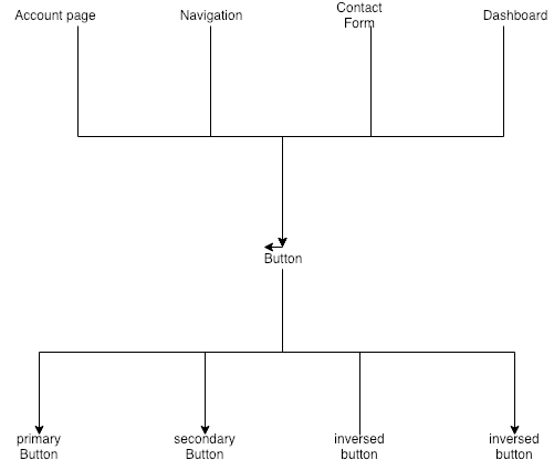
Button
Having implemented basic layout components, we can now proceed to a bit more approachable stuff. Let’s try to improve our Button that we saw in the introduction. What if we could have a loading sign being displayed, based on props. Remember, we want to have one entry point for the component, the component itself should take care of the rest, logic, styling and markup. For the loading sign to be displayed, we don’t want our caption, meaning React children, to be visible. Our component instance could look somewhat like this:
<Button loading={this.state.loading} />
When we look at the code, we see that the children are dynamically rendered, depending on the prop loading :
import React from 'react'
import styled, { css } from 'styled-components'
import Loader from './Loader'

const StyledButton = styled.button`
    border-radius: 5px;
    background-color: ${props => (props.secondary ? '#F7A072' : '#a1cdf1')};
    color: #fff;
    padding: 10px 15px;
    font-size: ${props => {
        if (props.big) return '20px'
        return '16px'
    }};
    outline: none;
    border: none;
    cursor: pointer;
    margin: 15px;
    border: 2px solid ${props => (props.secondary ? '#F7A072' : '#a1cdf1')};

    ${props => {
        return (
            props.inverse &&
            css`
                background-color: #fff;
                color: #a1cdf1;
            `
        )
    }}
`

const Button = ({ secondary, big, inverse, loading, children, ...props }) => {
    return (
        <StyledButton secondary={secondary} big={big} inverse={inverse} {...props}>
            {loading ? <Loader small white /> : children}
        </StyledButton>
    )
}

export default Button
Note that I also added a Loader component. Have a look at the repo on Github to see what it does, I use it to display any loading state throughout the app, it can also be displayed top level, outside of the Button component.
Animated Card Component
Let’s tackle one more complex example, a card component with animations. We’re going to have a card that fades on page load and then displays its content. You can actually tweak any kind of behavior or animation and publish it through props. Another really nice trick is to have a scroll listener that will trigger the animation when our card comes on the screen and reverses the animation when we scroll to the top again (you can find an example for that on our website). For now, we’ll just have a fade-in animation.
<Card>...</Card>
<Card big>...</Card>
<Card primary delay={1500}>...</Card>
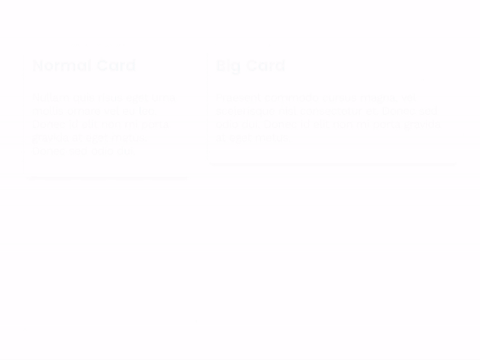
As you can see, with predefined components like that, you can really easily implement more complex behavior and appearance in your application, with just one line of code. As a bonus, your designer will be very happy because the app looks exactly like he has imagined. When there are design changes, it is incredibly easy to implement them. Simply change the base component and the changes will apply throughout the whole application. Here’s the code for the card component:
import React from 'react'
import styled, { css, keyframes } from 'styled-components'

const animatedCss = css`
    opacity: 1;
    transform: translateY(0);
`

const primaryCss = css`
    background-color: #008bf8;
    color: #fff;
`

const StyledCard = styled.div`
    width: ${props => (props.big ? '450px' : '300px')};
    padding: 15px;
    opacity: 0;
    transform: translateY(50px);
    transition: 500ms all ease-in-out;
    margin: ${props => (props.noMargin ? 0 : '15px')};
    box-shadow: 0 5px 15px -5px rgba(0, 0, 0, 1);
    border-radius: 5px;

    ${props => props.animated && animatedCss}
    ${props => props.primary && primaryCss}
`

class Card extends React.Component {
    constructor(props) {
        super(props)
        this.state = {
            animated: false,
        }
    }

    componentDidMount() {
        setTimeout(() => {
            this.setState(() => {
                return { animated: true }
            })
        }, this.props.delay)
    }

    render() {
        const { delay = 0, noAnimation, primary, noMargin, big, ...props } = this.props
        return (
            <StyledCard
                animated={this.state.animated}
                delay={delay}
                primary={primary}
                noAnimation={noAnimation}
                big={big}
                noMargin={noMargin}
                {...props}
            />
        )
    }
}

export default Card
Now you might wonder why I have the delay prop. This seems a bit odd in the example above, but comes in extremely handy when having a whole list of cards:

Heading
Before we finish up, I just want to show the code of the Heading component, it should be clear by now how to use it:
import React from 'react'
import styled, { css } from 'styled-components'

const baseStyle = css`
    margin-bottom: ${props => props.noMargin && '0'};
    color: #202020;
    font-family: 'Poppins', sans-serif;
    font-weight: 600;
    margin-top: 0;
    text-align: ${props => {
        if (props.center) return 'center'
        if (props.right) return 'right'
        return 'left'
    }};

    max-width: 100%;
`

const HeadingOne = styled.h1`
    font-size: 42px;
    font-weight: bold;
    margin-bottom: 25px;
    ${baseStyle};

    @media (max-width: 480px) {
        font-size: 40px;
    }
`

const HeadingTwo = styled.h2`
    font-size: 36px;
    font-weight: bold;
    margin-bottom: 20px;
    ${baseStyle};
`

const HeadingThree = styled.h3`
    font-size: 28px;
    font-weight: bold;
    margin-bottom: 15px;
    ${baseStyle};
`

const HeadingFour = styled.h4`
    font-size: 22px;
    font-weight: bold;
    margin-bottom: 10px;
    ${baseStyle};
`

const HeadingFive = styled.h5`
    font-size: 18px;
    font-weight: bold;
    margin-bottom: 5px;
    ${baseStyle};
`

const Heading = ({ h2, h3, h4, h5, noMargin, right, center, ...props }) => {
    if (h2) return <HeadingTwo noMargin={noMargin} right={right} center={center} {...props} />
    if (h3) return <HeadingThree noMargin={noMargin} right={right} center={center} {...props} />
    if (h4) return <HeadingFour noMargin={noMargin} right={right} center={center} {...props} />
    if (h5) return <HeadingFive noMargin={noMargin} right={right} center={center} {...props} />
    return <HeadingOne noMargin={noMargin} right={right} center={center} {...props} />
}

export default Heading

Photo by Kevin Crosby on Unsplash
Wrapping up
We covered a whole lot by now. Building a component system can be fun and does save you a lot of time in the long run. By enforcing a design system through reusable components, you ensure that your whole application looks according to the guidelines and changes can easily be implemented. Components should be built vertically, having one entry point and the possibility to return different elements, visual features or behaviors. The Heading component for example returns different html elements based on what props you pass. You can think of it as a “connector” between your explicit components and the behavior below the reusable entry point.
To keep track of your components and remember what possible options there are, you can have a look at the destructured props or simply by checking the styled-components style declaration. To have a common ground for designers, developers and even product owners or stakeholders, you can build a sample page with all possible components. When you clone the repository, you will see that I did the same. Be creative and try to build your own reusable components, what I often build are: Input (also including more logic), List, Table, Separator, Text and more!
May 2021 - 30 min read